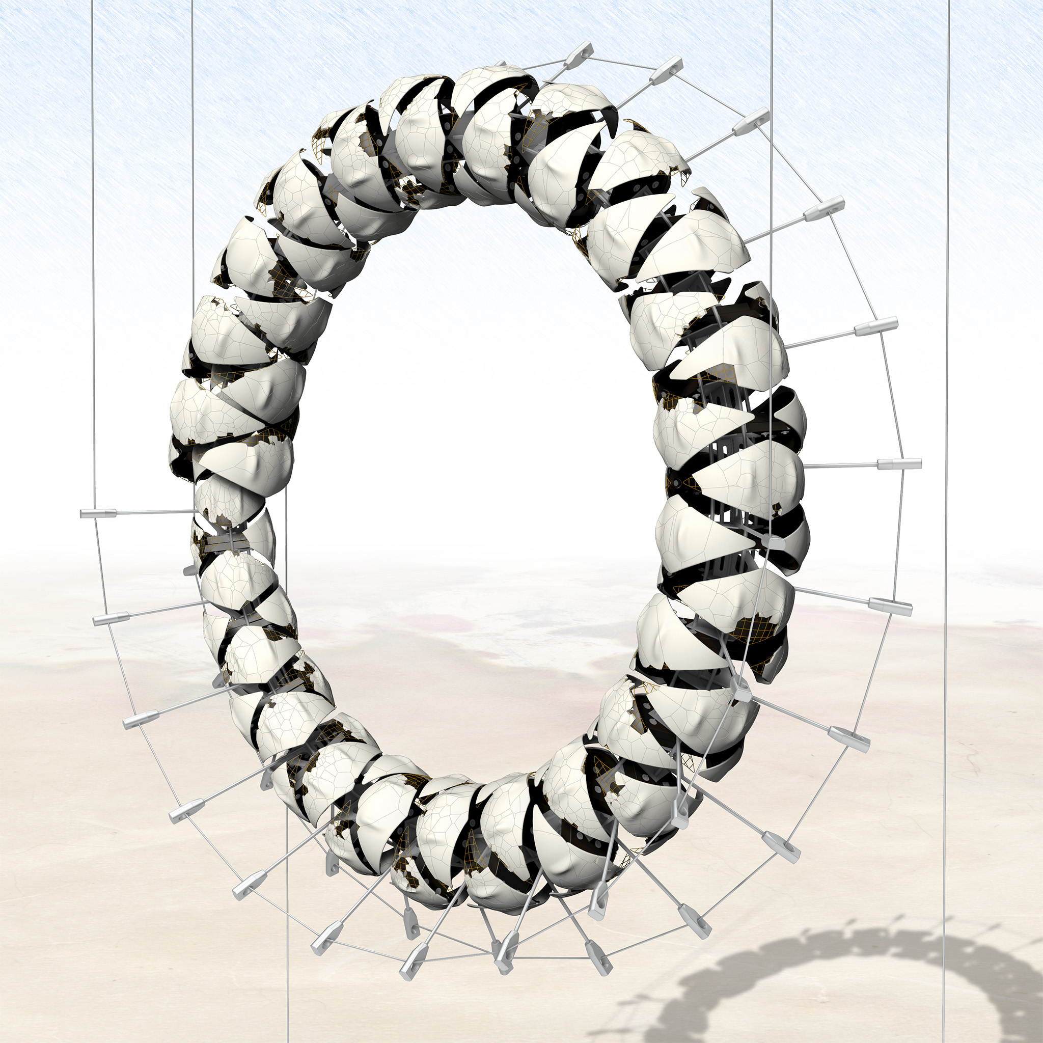
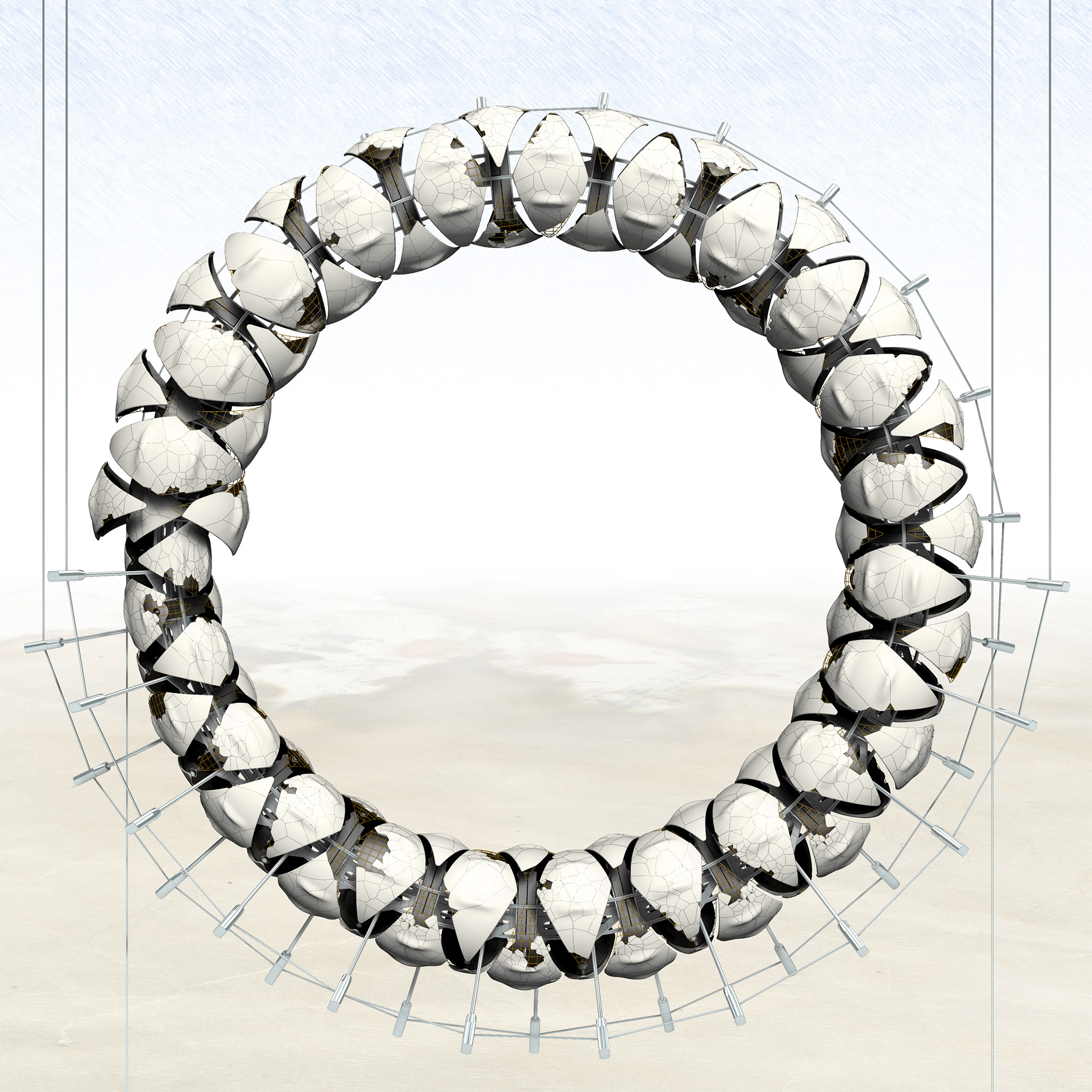
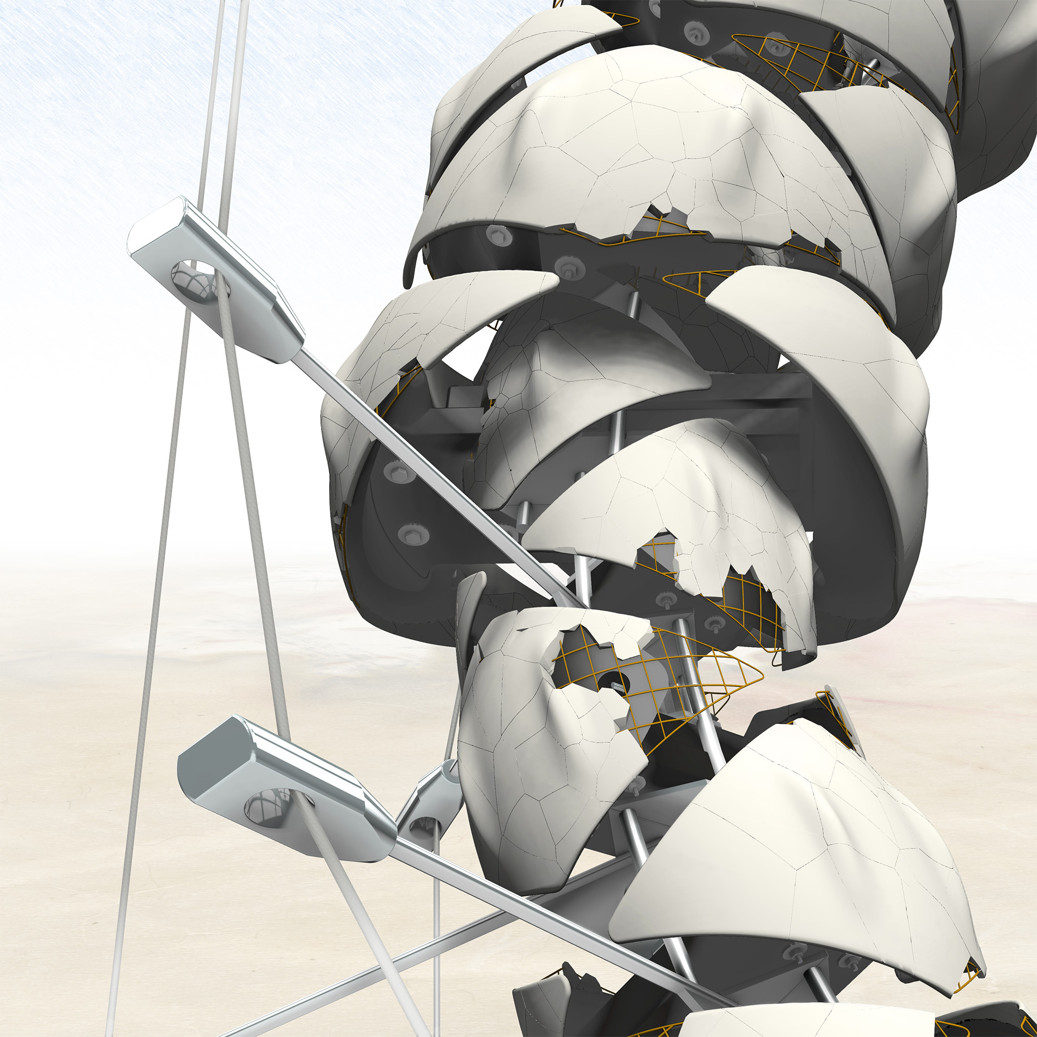
So, a proposal for plaster, steel, & resin, this unrealized (but realizable—if you or your friendly neighborhood oligarch have the requisite funds burning a hole in your deep pockets!) sculptural piece has some geometric characteristics in common with the realized “test” sculpture Zahir (2014) and the unrealized piece Rigsum Gonpo (2018): it’s a formal process I developed for dividing a curved or double-curved surface that I generally refer to as, “Kites & Spikes”, or KSP. And like the latter sculptural piece, it would be suspended on cables in an elaborate fashion. (The central wind-vane/sculpture from my speculative architecture project Paradis House (2022-2023) is also a KSP development.)
But of course, what we have here is also a symbolic depiction of Ouroboros, “yͤ wyrm he hath devour’d his owen tayl”. Hermetic, Ægyptian symbol or renewal, rebirth, and so forth: feel free to look it all up in Wikipedia.
IMHO, the self-cannibalizing worm seems more like a symbol of futility and the pointlessness of all our hopes and dreams. But that’s just me: who am I to gainsay all the great alchemists and philosophers? I’m just an extremely unsuccessful architect. Also, deliberately this thing invokes the famous ensō of Zen. Empty empty empty emptiness eating itself and everything else.
No, I know that is not standard Zen.
But it is the shape of the world.
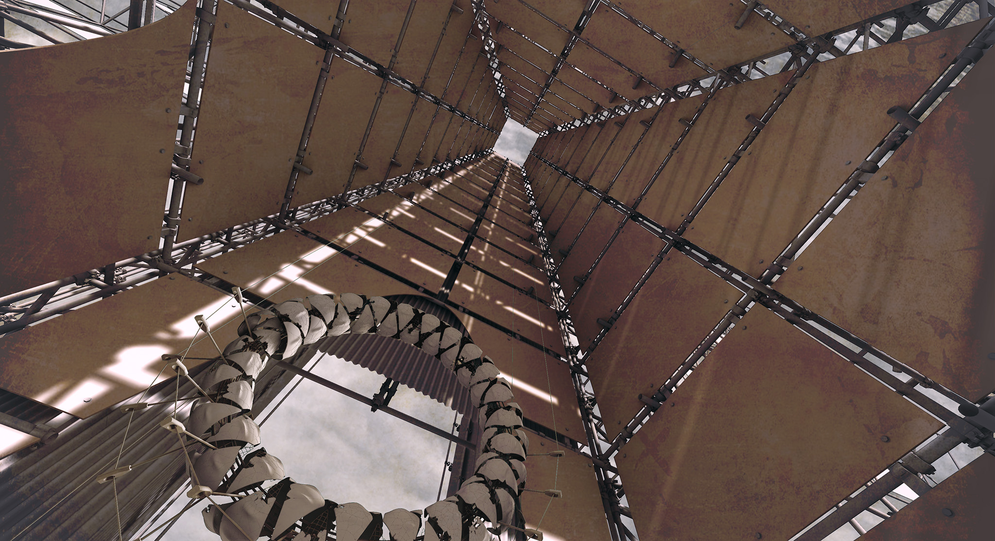
This sculpture began as a piece of entourage for my speculative and oneiric architectural projected, The Hotel End-Times (2024) and the last image in the gallery above is a kind of quick mockup of the Ouroboros suspended under the Hotel’s central oculus. The original idea was that the cable-suspended sculpture would be lowered into place just as the bier with “the client” was raised by means of cables and a complex windlass mechanism to the top of the Hotel. In the event, with the final designs for the Hotel interior the Ouroboros became unnecessary and was discarded from the scheme in favor of other elements. However, I remain fond enough of the design to use it feature it on two variations of my 2025 Sinosphere business card, supplementing the older business card that featured the Rigsum Gonpo (2018) concept. The exaggerated half-tone pattern in the upper section of the newer cards serves to obscure certain color banding issues during printing.
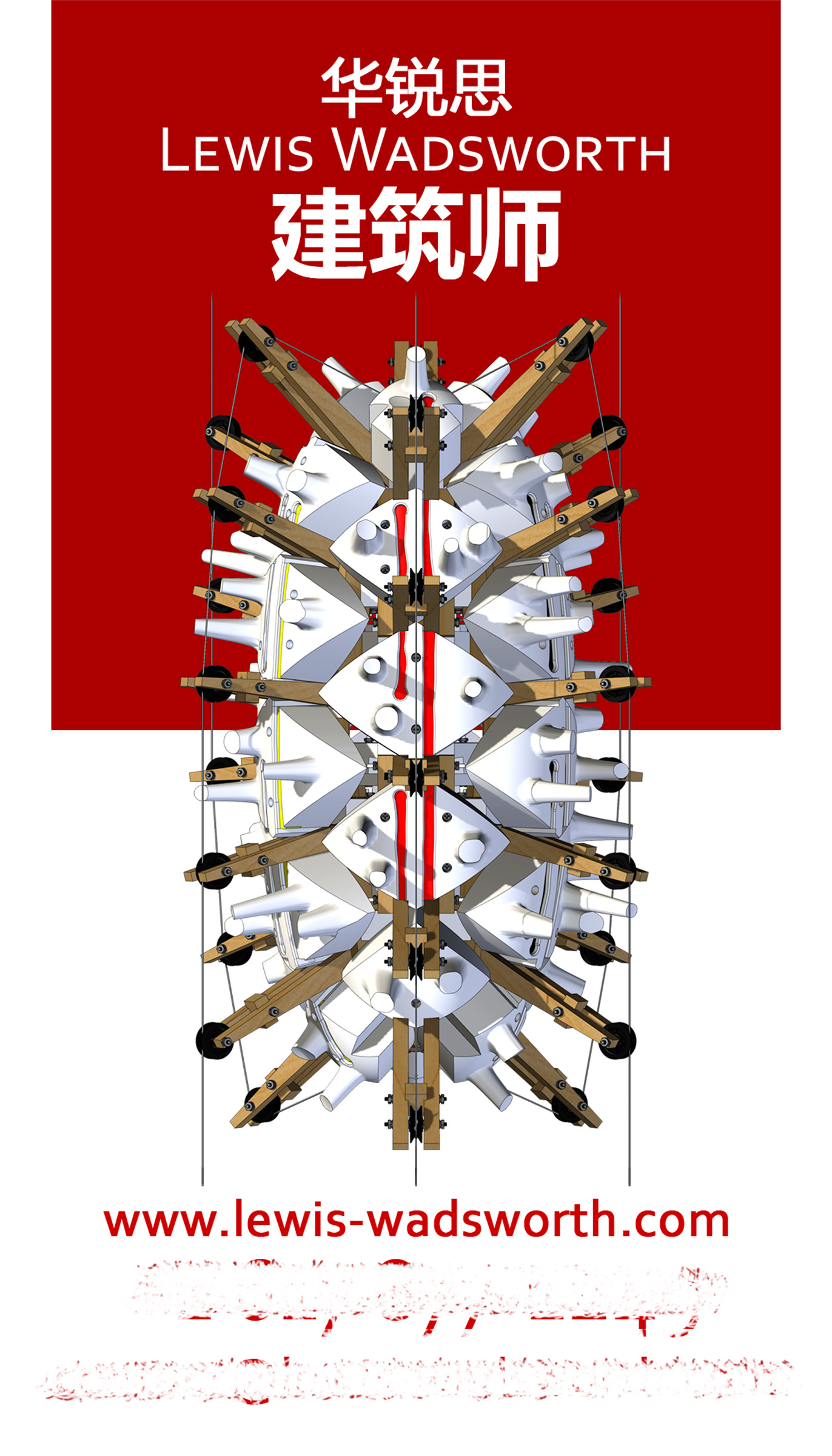
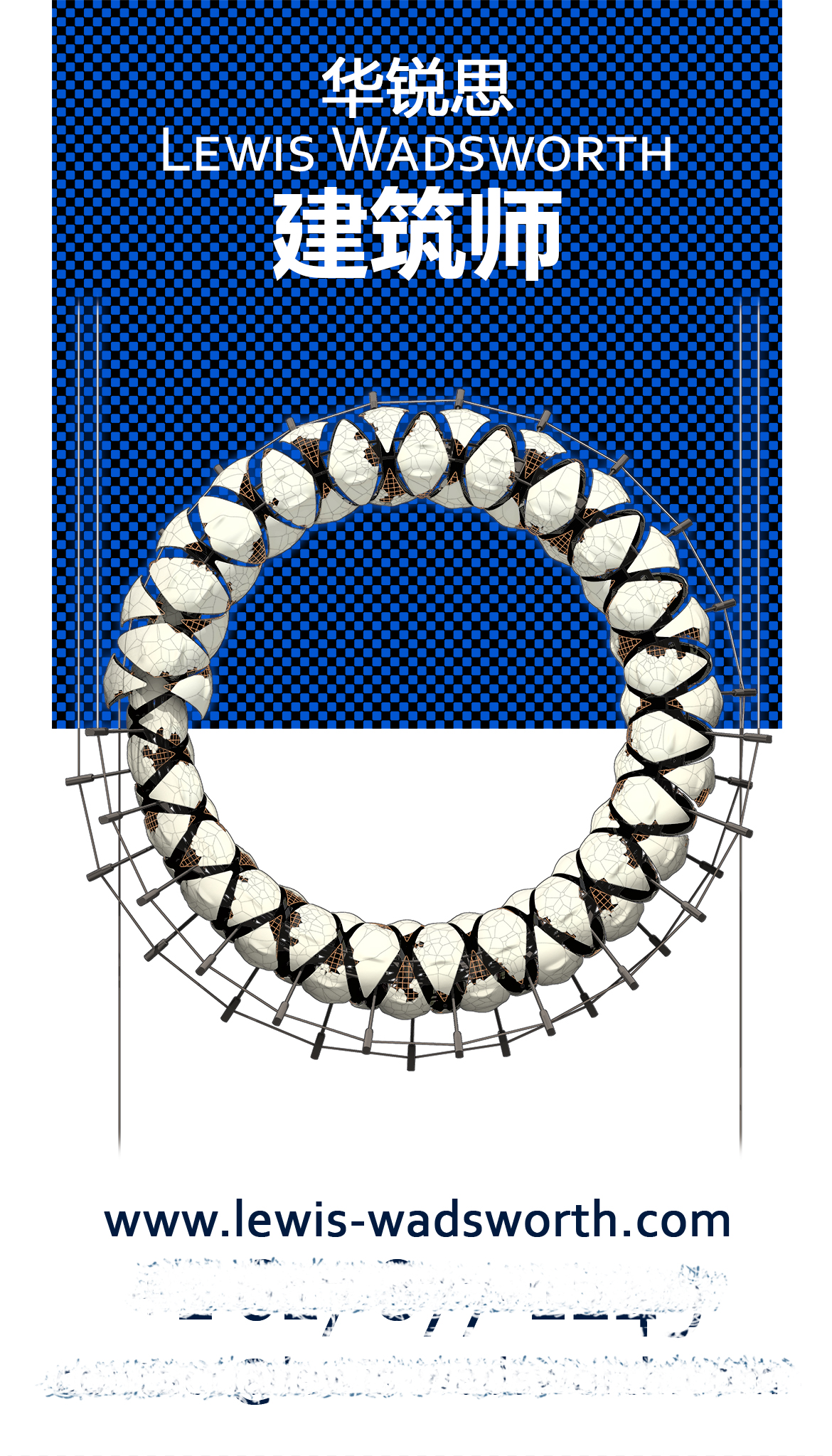
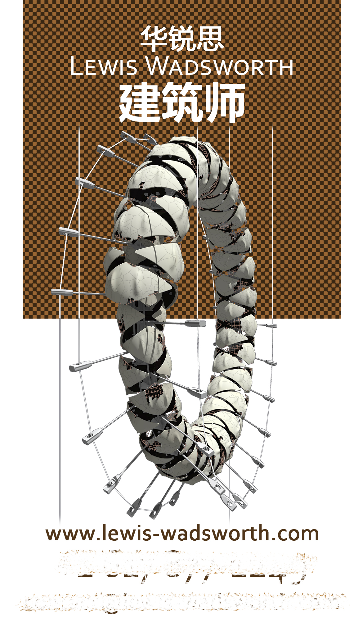
(I’m relatively certain that none of my self-designed business cards have served any purpose other than to baffle or even distress the unfortunate souls who have received them.)
Leave a Reply